
The Day Kevin Smith Quit
A panic attack, a red pen, and one brutal lesson in how comics actually talk.

The Guardian Devil in the Details
Back in 1998, we were deep in prep on the launch of Marvel Knights.
All the artists were hard at work. Pages were moving. Books were being built. Everyone had something to do.
Except me.
I was sitting in the studio, staring at my board, wondering what the hell I was supposed to draw, because I couldn’t get a script for Daredevil #1 from Kevin Smith.
Now, this wasn’t because Kevin was slacking. He was knee-deep in production on Dogma, which meant he was trying to make a movie while also carrying the pressure of helping us launch an imprint.
Not exactly a light afternoon.
And it wasn’t just any book.
This was Daredevil.
A character that meant the world to both of us. A character with Frank Miller’s shadow still hanging over him. Ann Nocenti’s run. All the great stuff that came before. That’s a lot to walk into, especially when it’s your first mainstream comics gig.
So the clock is ticking. The deadline is getting closer. I’m trying to get Kevin on the phone and having no luck.
Then my phone rings.
It’s him.
I was relieved.
Finally. Great. He’s calling because he has something for me to draw.
Nope.
He was calling to quit.
I just sat there and listened as Kevin laid it out. He couldn’t crack it. He didn’t have the story. He didn’t know what to do.
I could hear the pressure in his voice. This wasn’t a guy being difficult, this was a guy drowning.
I stammered a little.
“Are you sure?”
Then I tried all the usual psychological nonsense you try when someone’s confidence is shot.
Don’t put that kind of pressure on yourself.
It doesn’t have to be perfect.
Just get something down.
We’ll figure it out.
You know, all the stuff you say when you’re secretly thinking, Please don’t make me call Marvel and tell them the first Marvel Knights book is now a smoking crater.
But Kevin wasn’t having it.
It wasn’t just the pressure.
He didn’t have a story.
So I finally said, “Okay. I understand.”
Then I hung up the phone and immediately called Jimmy Palmiotti, my creative partner on Marvel Knights.
“Kevin’s out.”
“What do you mean, he’s out?”
“He’s out. He’s quitting the book.”
“What? What are you talking about?”
I laid out the whole call.
Jimmy went quiet.
Then we hung up because there was nothing left to say and everything left to solve.
To say I was having a bad day is like saying the Hindenburg needed better parking.
I honestly can’t remember if it was later that night or the next day when Jimmy called me back.
“Kevin’s back on the book.”
“Wait. What happened?”
Jimmy said, “I bad-copped the shit out of him.”
And he did.
Jimmy called Kevin and guilted him within an inch of his life.
“How could you do this to your friend? You know how much Joe loves you. You destroyed the guy. He’s an absolute mess right now. What kind of asshole does that?”
According to Kevin, it went on for quite some time. And knowing Jimmy, what I’m remembering is probably the Hallmark version.
But it worked.
Kevin changed his mind.
Great.
One problem.
Kevin still didn’t have an idea.
Time kept moving, because deadlines don’t care about your problems, and eventually Kevin called me again.
This time, he had it.
He had found the idea he felt was worthy of relaunching Daredevil.
Yes.
Kevin had the story.
The problem was…
I didn’t have the story.
The window was closing fast, and nothing would have killed the Marvel Knights launch quicker than the first book in the line shipping late.
By the time I finally got something from Kevin, we were about a month and a half away from needing the book completed and at the printer. And what I got wasn’t exactly a script. It was maybe four or five paragraphs. Maybe less. A rough description of what happened in the story.
I knew that was probably the best we were going to get out of Kevin until Dogma was done, so I took that outline, broke it down into scenes and pages, and started drawing as fast as I possibly could.
Once the pages were done, I sent them to Kevin so he could script them and crossed my fingers.
And we got it back in time.
I was beyond excited. I couldn’t believe it. We were actually going to hit the deadline.
Then I read it.
There was a lot of dialogue.
I mean, a lot.
If you know Kevin’s work, this should not have surprised me. His movies are dialogue-heavy. That’s part of the charm. That’s the music. That’s the rhythm. That’s Kevin.
But comics are not movies.
In a movie, dialogue rides on top of time.
In comics, dialogue takes up real estate.
Every word needs a place to live. Every balloon needs space. And every balloon you add is something the reader sees before, during, and sometimes instead of the art.
Kevin was anxious to know what I thought.
I told him, “It’s great. I’m going to send you a few corrections.”
When he got it back, there were chunks of dialogue I had taken a red pen to.
Not because the lines were bad. So much of it was great, so much of it sounded, well, exactly like Kevin. There were just too many of them.
Kevin was not happy. He insisted all the dialogue had to stay.
I tried to explain the problem. When balloons pile up on a page, the white pulls your eye. The art gets crowded out. The reader stops experiencing the story and starts processing text.
“Kevin, you’re going to open that first issue and be floored by how much white you see.”
He heard me.
He did not agree with me. And we were too far behind for me to try to convince him otherwise. So I let it go.
The issue came out. Kevin got his copy. He called me.
And the first thing he says to me is…
“Man, that’s a lot of white.”
And then he laughed.
To Kevin’s credit, he got it immediately. You can see it happen over the next few issues. By issue three, he was already tightening. By issue five, he had a much better feel for how much dialogue a page could actually hold.
He figured it out the way most of us figure things out in comics.
He saw it go wrong in print.
That was my first brutal reminder that lettering isn’t something you deal with after the page is drawn.
It’s part of the page.
It can save a scene, bury a scene, or quietly make everything work so well that nobody thinks to thank the person who did it.
THE INVISIBLE LANGUAGE OF VISUAL STORYTELLING
Part 21: The Voice on the Page
What Kevin saw when he held that first issue was the shape of words on a page.
The physical fact of them.
In comics, somebody makes every decision about those shapes. Where they sit. How big they are. What kind of line holds them. How much room they take. What they cover. What they reveal. What order you read them in.
That person is often the last creative hand to touch the page before it goes to print.
And almost nobody knows their name.
The Last Hand
Think about the last time you were fully inside a comic.
Not reading it.
Inside it.
Characters had voices. You heard them. Not with your ears, but somewhere in the back of your head, in the place where language starts pretending to be sound.
A door slammed and you felt the weight of it.
A villain said something small, and it landed like a threat.
Something exploded across the page, and the explosion had a shape.
Who built that?
The writer gave you the words. The artist gave you the pictures. The colorist gave you light, temperature, mood.
But the voice?
The weight?
The sound that lived between the image and the dialogue?
That was the letterer.
We’ve talked about panels as beats. We’ve talked about staging, power, the eye moving across a page. But all of that happens in silence unless someone gives it a voice.
Depending on the book, the letterer might be the fifth or sixth creative hand on the page. They’re almost always the last one.
And somehow, still the one nobody names.
Ask a hundred comics readers to name their favorite letterer and ninety-eight of them will look like you just asked them to explain escrow.
But think of it this way.
In Lesson 8, we said a comics page is music. Panels are beats. Page turns are rests. Repeated shapes create rhythm. That idea becomes literal with lettering.
The tempo, the volume, the texture of how a character sounds. All of that lives in the lettering.
When it works, you don’t notice the machinery.
The Look Of A Voice
Every character already has a voice.
The letterer’s job is to find it.
Neil Gaiman’s Sandman ran for 75 issues. Todd Klein lettered most of it, and one of the things Klein did brilliantly was give the Endless distinct visual voices.
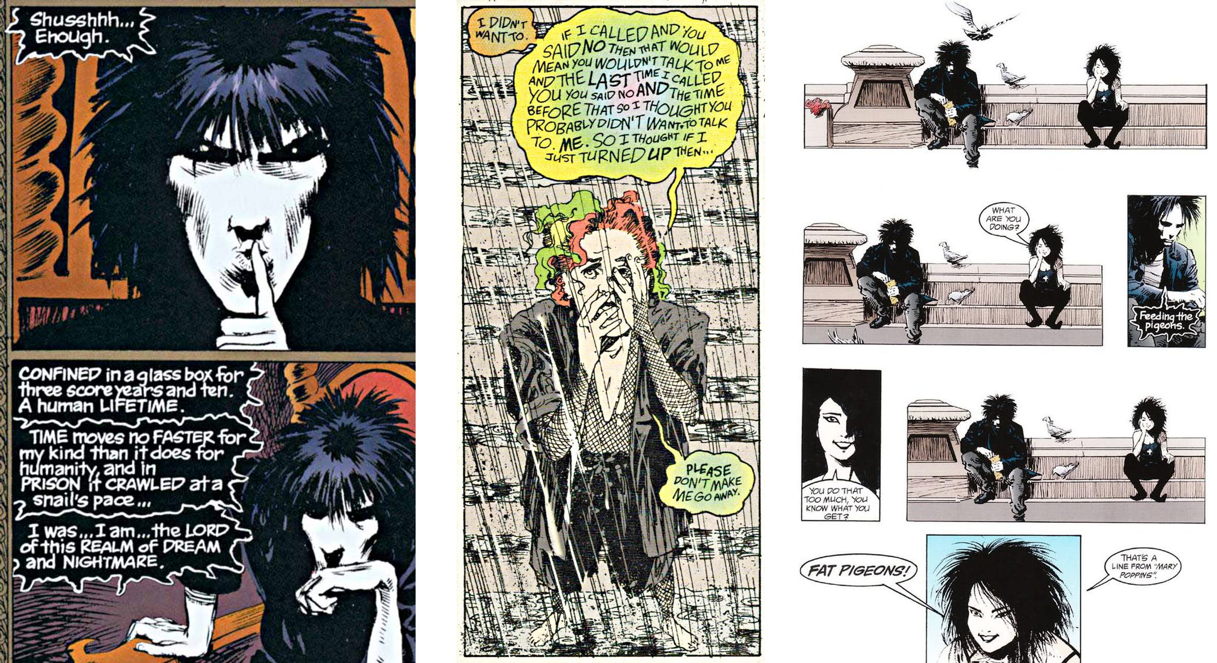
Dream’s dialogue felt formal, classical, a little cold. Death’s felt warmer, rounder, more human. Delirium’s words barely stayed in line, because Delirium herself barely stayed in line.
Before you read a single word of her dialogue, you knew something was different.
Off-kilter.
Unstable.
The lettering told you.
That’s characterization. And it’s happening before the sentence even lands.
Before you read the words, you already know whose mouth they came from.
Dave Sim lettered every issue of Cerebus himself. All 300 of them, over 26 years. He created distinct lettering styles for his major characters, so when a balloon appeared, recognition often happened before reading
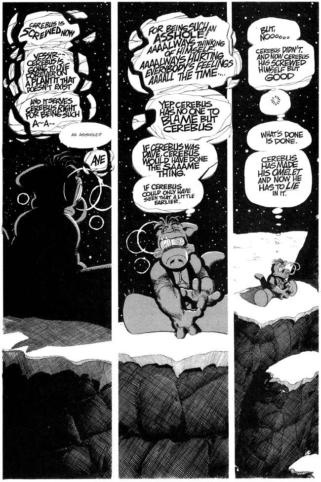
You didn’t just read the character.
You saw the character’s voice.
That’s a subtle distinction, but it matters.
Because once a reader recognizes a character by the shape of their words, the lettering has become part of who that character is.
Tom Orzechowski’s lettering on Uncanny X-Men did something a little different, and just as important.
He didn’t just carry Chris Claremont’s words. He helped manage them.
Those pages could be dense, emotional, melodramatic, weird, overloaded with information, and still somehow readable. That doesn’t happen by accident. Orzechowski gave that density rhythm. He helped the reader move through all those captions, balloons, thoughts, speeches, interruptions, and big emotional declarations without the page collapsing under its own weight.
That kind of lettering becomes part of the title’s sound.
If you grew up reading those books, you absorbed it without thinking about it.
You don’t notice something like that until it’s gone.
The next time you pick up a comic that’s working, pay attention to the first thing you register about a balloon before you read it.
Shape.
Weight.
Placement.
Attitude.
If the lettering is doing its job, you already know something before the words begin.
Balloon Placement Is Blocking
Here’s something that can wreck a scene without the writer or artist doing anything wrong.
Western readers move through a page from left to right, top to bottom. Inside a panel, your eye is looking for the same kind of order.
The first balloon you hit determines what you know first.
Get that wrong and the scene breaks.
Character A says something brutal.
Character B reacts.
The art is strong. The dialogue is right. The acting is there.
But if the balloon placement puts B’s reaction before A’s line, the reader processes the reaction before understanding what caused it. The moment fires backward.
By the time they reach the line that caused everything, they’ve already spent the emotional impact on the wrong beat.
Balloon placement is blocking. It determines what the reader sees first, and first always wins.
This is one of the most common panel-level mistakes in comics, and it almost never gets called out because it’s easy to blame the script or the art. But sometimes the problem is simpler than that.
The balloon is in the wrong place.
Which, to be fair, might be a bold creative choice, but probably not the one you wanted.
In Lesson 4, we talked about movement inside a panel: how the eye travels and what it finds along the way. In Lesson 6, we looked at power and staging, how position communicates hierarchy.
Balloon placement is where those ideas meet.
The balloon is part of the composition.
It isn’t floating above the image.
It’s inside the image.
A balloon pressed into a corner can feel isolated.
A balloon bleeding off the edge can feel interrupted.
A balloon sitting dead center can feel declarative, final, unavoidable.
Good letterers understand that they are staging a scene, just as surely as a director blocking actors.
These aren’t design choices.
They’re storytelling choices.
The Grammar of Sound Effects
A sound effect is not a description of a sound. It’s a physical object that takes up space on the page.
Treat it like one.
BA-BLAM and THWACK are not interchangeable.
BA-BLAM has two beats: the shot, then the impact.
THWACK is immediate. Single. Hard.
K-K-KRAK has a stutter to it, the slow fracture of something giving way.
The spelling carries timing.
The size carries volume.
The angle carries direction.
Color and shape matter too.
A jagged red CRACK and a rounded blue CRACK are not the same sound. One is violent. One might be comedic. Five identical letters, completely different tonal registers.
The letterer makes that call.
Sometimes a sound effect does everything at once.
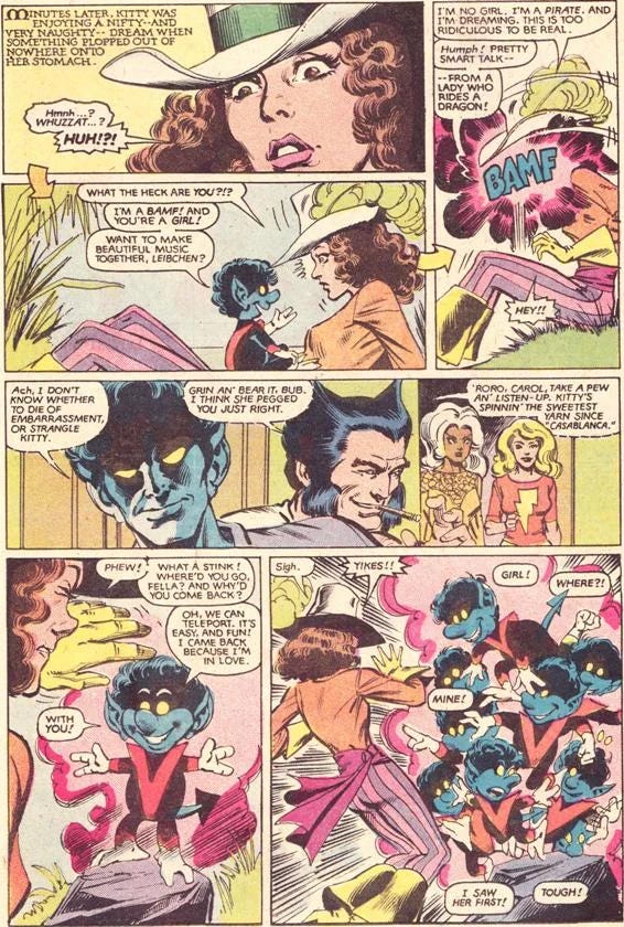
Excalibur #43, 1991. Written and drawn by Alan Davis, lettered by Michael Heisler.
A character named BodyBag from TechNet makes the catastrophic mistake of eating Kitty Pryde’s teddy bear. Turns out he’s violently allergic to nylon polymers.
At the bottom of the page, he rushes into the bathroom and slams the door shut.
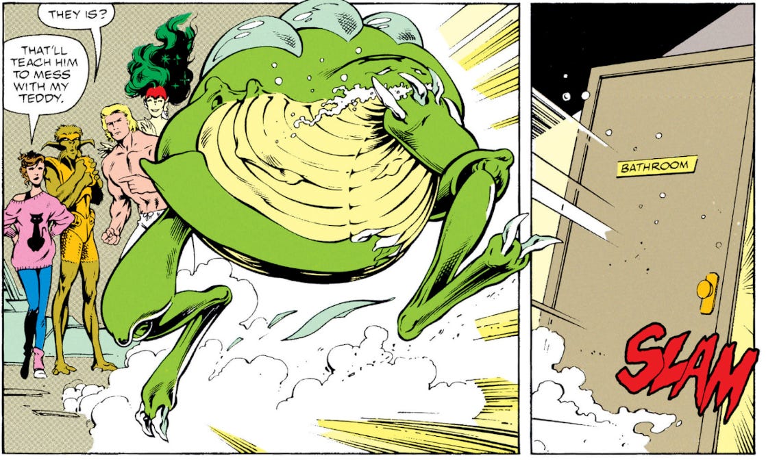
Then you turn the page.
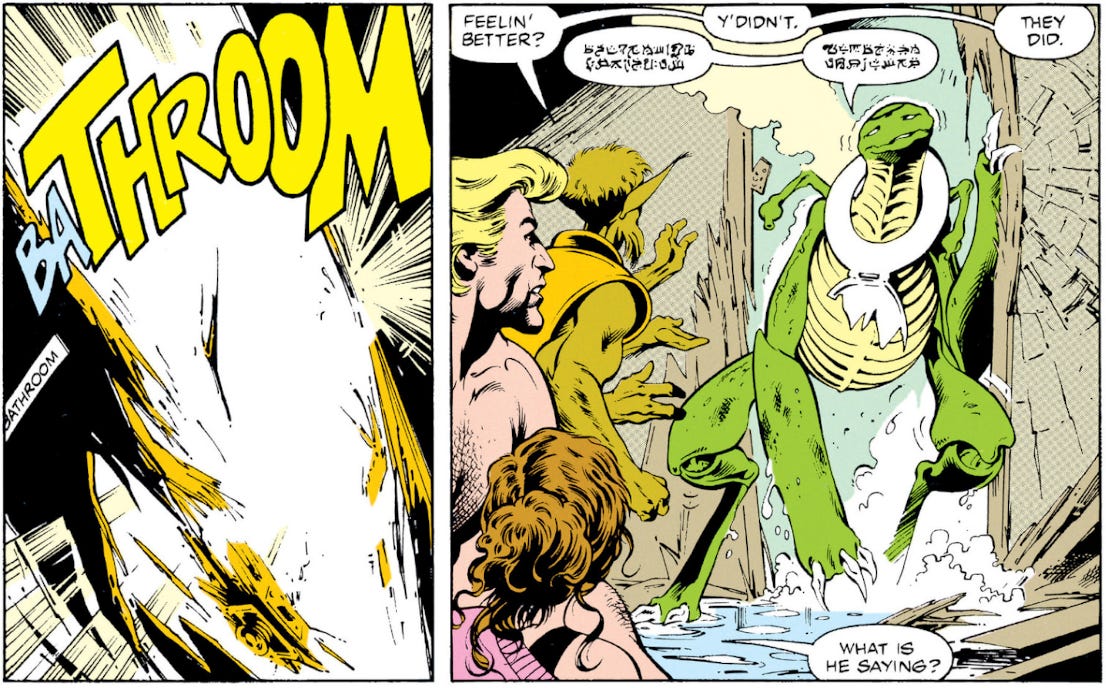
Perfection.
The page turn is the pause. The sound effect is the punchline, the impact, and the sound, all in one stupid, beautiful word.
Alan Davis wrote and drew the book, and he knew exactly what was waiting on the other side of that page turn. But Michael Heisler had to land it.
The size had to be right. The weight had to be right. The shape had to feel like an explosion and a joke at the same time.
Walt Simonson’s Thor run is one of the clearest examples of a writer-artist understanding sound effects as compositional elements from the first mark on the page.
Working with letterer John Workman, Simonson designed sound effects that didn’t decorate the action.
They were the action.
They spanned panels, bled into gutters, sat at angles that matched the physics of what was happening. The sounds were part of the architecture. You couldn’t lift them off the page without breaking the image.
That’s when lettering stops being text.
It becomes drawing.
Invisible, Not Unseen
Here’s how you know the lettering worked:
You don’t remember it.
Not because it didn’t matter.
Because it mattered so completely that it disappeared into the experience.
When a reader is fully inside a story, they’re not thinking about fonts. They’re not thinking about balloon placement. They’re not thinking about whether a sound effect is weighted correctly.
They hear the characters.
They feel the impacts.
The machinery disappears.
But when a font feels wrong for a character, when a balloon breaks the reading order, when a sound effect doesn’t match the weight of what it’s describing, the reader gets yanked out of the story and starts noticing the page as a page.
That’s usually not what you want.
Todd Klein’s work on Sandman is a great example of lettering serving the story so completely that it becomes inseparable from the story. It’s not unseen. It’s invisible.
That’s why lettering is such a thankless miracle.
If you don’t notice it, someone probably did beautiful work.
Next Week
Lettering, staging, rhythm, color, time, all of it operates inside a system of conventions that comics have built over more than a hundred years.
In seven days, let’s talk about when and how to leave the system.
Thanks for reading.
You’re AMAZING!
JQ
Sorry but a professional creative person with a comics obsession didn’t realize a comic book isn’t a talky screenplay?
Todd Klein’s work was so important that a significant portion of fan complaints about the Netflix Sandman adaptation was that the characters didn’t sound like they did in the comics…
(And praise to Tom Sturridge was that he did.)