How I Design a Cover: A Step By Step Journey Into Madness.
Plus: A Photo Exclusive: The Last Thing Batman Saw Before He Died! And Announcing The First Ever "Drawing The Line Somewhere" Contest.
O Canada, Here I Come!
I’m Toronto-bound! If you’re attending FanExpo Canada (and why wouldn’t you?), here are my signing and panel times.
Thursday, August 24: 6:00-7:00 PM
Friday, August 25: 11:00 AM-12:30 PM and 4:00-6:00 PM
Saturday, August 26: 11:00 AM-12:30 PM and 4:00-6:00 PM
Sunday, August 27: 11:00 AM-12:30 PM and 4:00-5:00 PM
JOE QUESADA’S DRAWING THE LINE SOMEWHERE LIVE!
Friday, August 25: 2:30 pm in THEATRE #3: SPECIAL EVENTS [South Building - Level 700, Room 701A]
JOE QUESADA’S MARVELOUS JOURNEY!
Sunday, August 27: 1:15 pm in THEATRE #3: SPECIAL EVENTS [South Building - Level 700, Room 701A]
For more details about prices, experiences, and panels, gently caress the buttons below.
Really, REALLY not a tribute band.
Since last week’s entry was a longer read than usual, today will be a bit more show than tell, starting with this sketch I finished last night for a new Canadian member of “The Experience.”
That’s a “Bat-Wrap.”
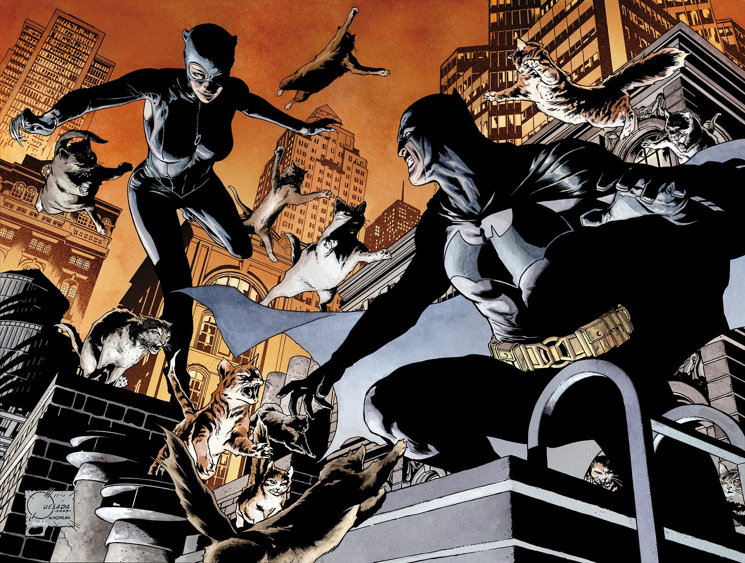
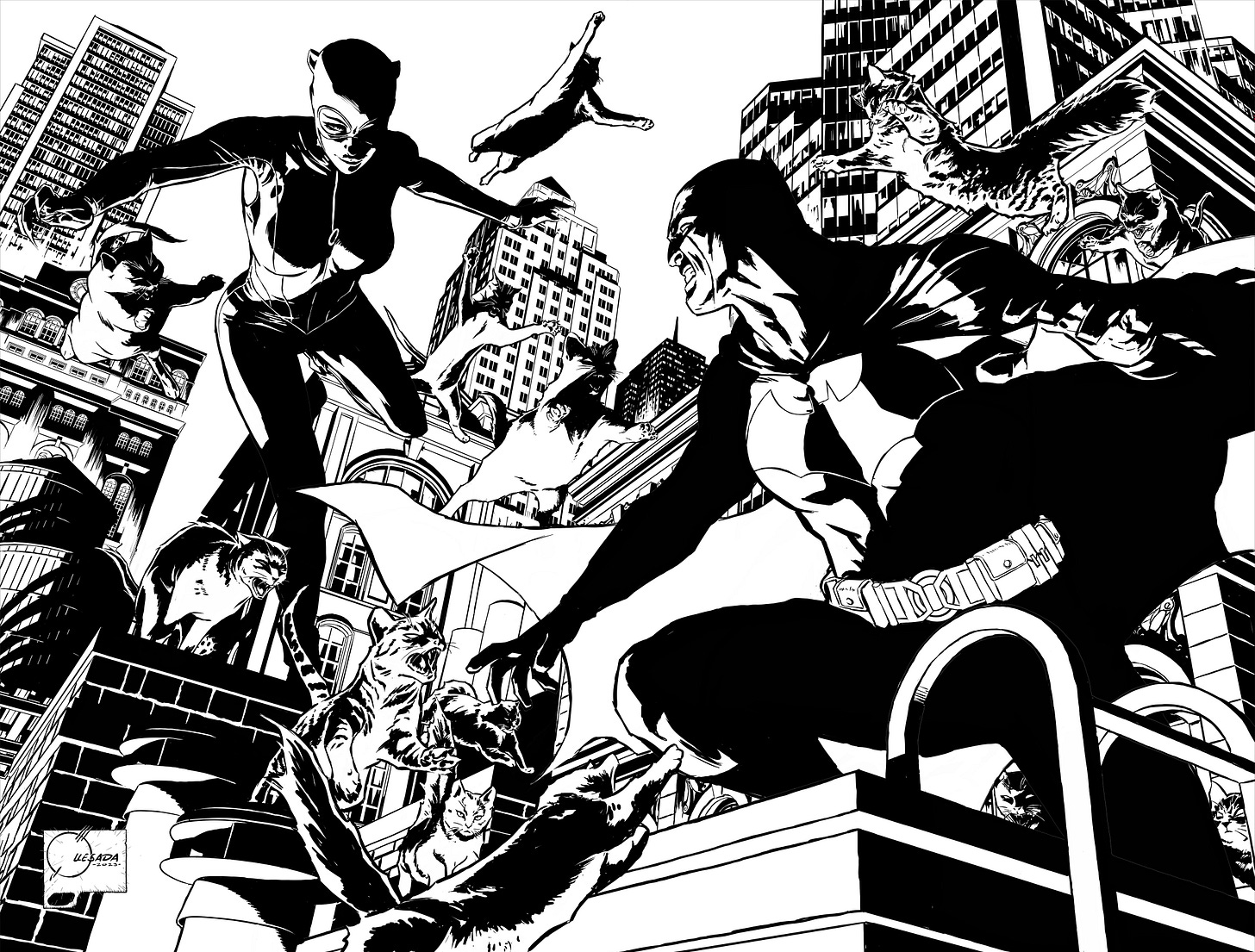
In case you haven’t seen it, here are my latest connecting variant covers for Catwoman #57 and Batman 137, which go on sale on September 19. I’ve been having a blast drawing the ol’ Caped Crusader, but I’m staring down the barrel of an insanely busy Fall, so this will be my last Batman cover for a bit. That said, I want to give a shout-out to my editor Ben Abernathy, and everyone at DC who have been a pleasure to work with. Hopefully, when I’m ready to jump back on the “Bat-Saddle,” they’ll still want me to do more.
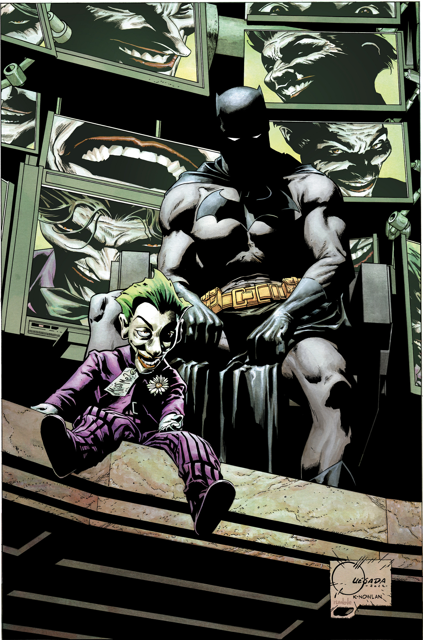
Knowing that this would be my “Bat Swan Song” for now and (spoiler warning) that he and Catwoman will be kicking each other’s asses in DC’s Gotham War event, I wanted to place Bruce in an unwinnable situation and end my run of covers on a note of finality.
Not to be overly morbid, but this is how I’ve always imagined Batman dying.
Here’s another angle from Batman’s video camera contacts which caught the moment of his death.
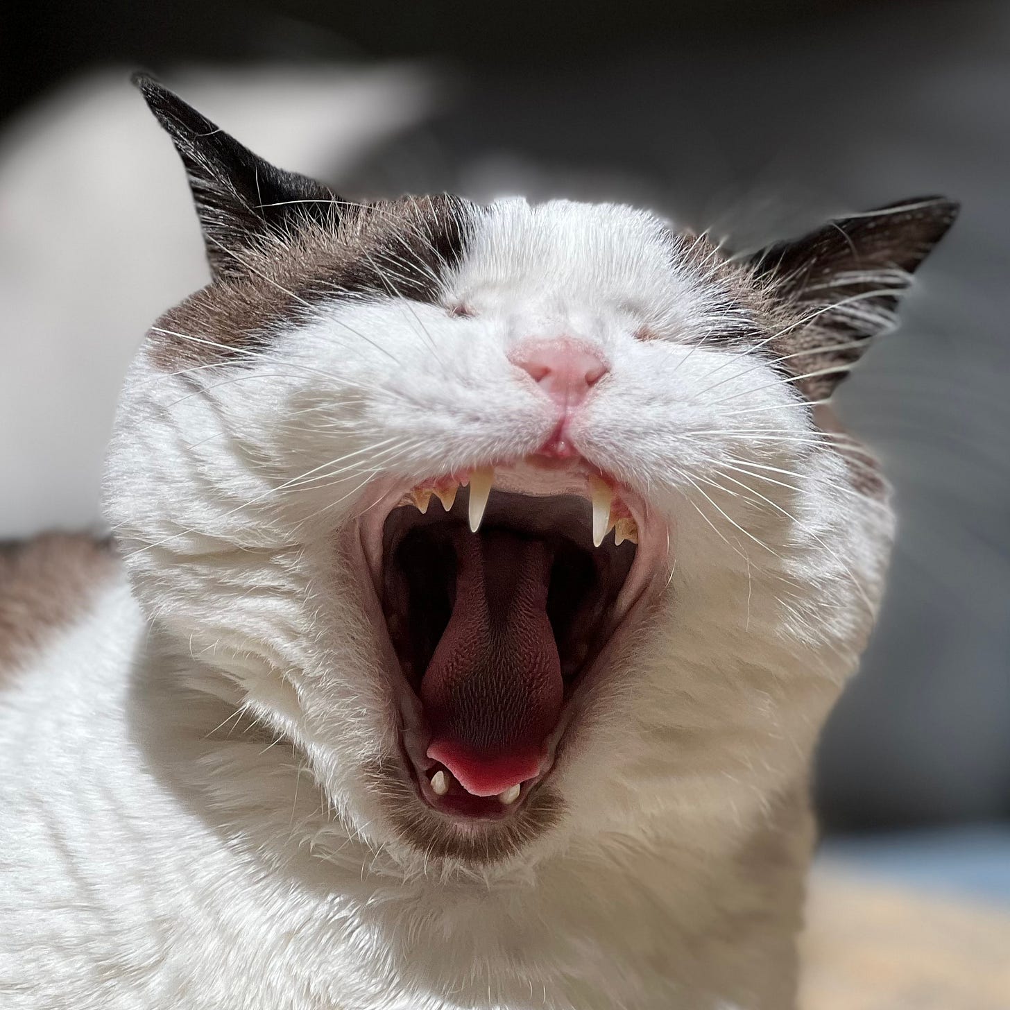
And speaking of that cover…
I Suffer From POD (Process Obsessive Disorder)
Before starting any new project, I do a ton of preliminary work. For every script, newsletter, cover, page, and panel I draw, there’s a trash can, real and or digital, filled with rejected ideas. Because I’m a giver, I’m going to take you on a little tour and share my madness with you.
I tend to do the majority of my thumbnails and layouts digitally these days, but because it’s so easy to zoom in and out and get lost in the details, I pay close attention not to enlarge my thumbnails beyond 3” x 4” as God intended it, because… well, it defeats the purpose of drawing a thumbnail.
Here’s my thought process going into this assignment. For your safety, this is a simplified version. Trust me, you don’t want to go where the demons live.
Since this single image would be split between two titles, it was important to design it so that each half stood alone as a single cover.
I wanted to use the Gotham landscape as the battlefield (why not, I have all the time in the world), so my instinct was to use a V shape design and a worm’s eye view camera to give the characters a larger-than-life feel.
On the top left, Cats and Bats are in a classic rooftop “let’s see who blinks first” stare-down.
For the middle thumbnail, I inverted the V design and added a Dutch Angle to give the image a sense of unrest because, clearly, someone is about to get their ass kicked. I almost went with this design until I drew the doodle on the right.1
Now that I’ve committed to a design, still working at 3” x 4”, my next step was to work out the anatomy, lighting, and perspective details.
In an effort to continue making things difficult for myself, I chose to uplight the characters. Borrowing from thumbnail 2, I applied a bit more Dutch Tilt to each subsequent thumbnail and a heightened wide-angle perspective to add a sense of vertigo and density to the cityscape as well as a self-induced aneurysm.
Fair warning: If you’ve ever mistaken me for a stable individual and would like to continue that fantasy, stop reading now because…
The image above is not the final inked piece; it’s my working digital layout. Once this is done, I print the layout to the size of my artboard, and I use a lightbox to pencil the image onto my custom-cut Eon paper!2
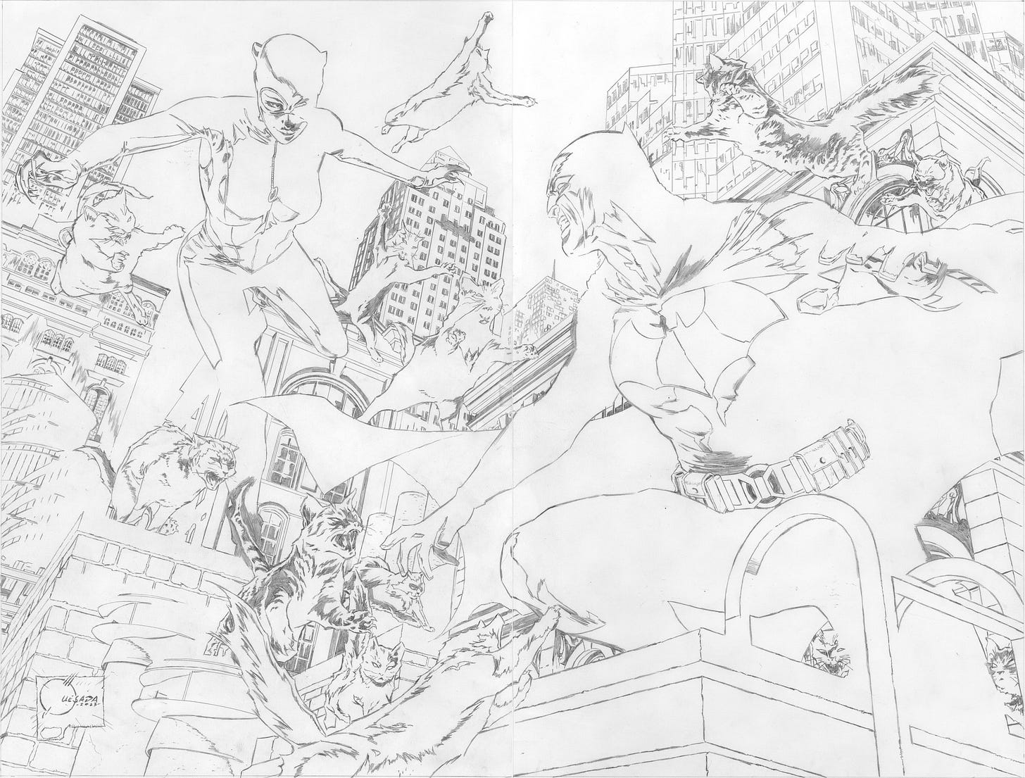
Not obsessive enough for you? Okay, how about this? Most original comic art is drawn at 1.5 times larger than the final printed comic, but in this case, I’m working twice up at 13” x 20” (actually 26” x 20” because it’s two connecting covers). Why? Because it’s fun!3
And I don’t get out much.
Well, that’s enough of that. Let’s change it up, shall we?
You Get a Comic! You Get a Comic!! And You Get a Comic!!!
The winner of our first “Suggest a Contest Contest” is Jeffrey Chang, who had an idea inspired by the secret titles I give my covers. Congrats, Jeffrey!
Okay, let’s get this started.
Caption This!
Here’s how it’s going to work.
Your suggested caption must be emailed HERE or reply to this email.
Entries added to the discussion thread or Chat will NOT be eligible.
The cut-off date for entries is this coming Monday, August 28.
I’ll choose the top three. Bribes are welcome but not expected.4
Then it’s all out Hunger Games, and you get to vote on the winner.
We good?
Cool.
GO!
As always, thanks for reading.
You’re AMAZING!
JQ
Don’t be surprised if you see a cover echoing the middle sketch at some point. Not everything goes in the trash. Sometimes ideas go in the recycle bin.
Hands down, the best professional artboards in the business.
Up until the 80s, original comic art was drawn twice up.
I’m kidding about the bribes… or am I?





The amount of storytelling a cover needs to do, plus leaving room for all that text...! It's no wonder covers aren't always the most honest advertising. At this point, I don't expect what's happening on the cover to literally happen inside the comic. It just has to feeeeeel the same. My incredibly imaginative approach to designing a cover is just to look at the works of much better artists and see what ideas I can "steal" (while modifying it quite a bit, of course).
Thanks for the great post!
This was really interesting to read!