
Working Backward
From Memory to Palette to Emotion

Last week, I sat down with Richard Isanove. Twenty-five years of coloring my work, and we’d never actually had this conversation, not like this. If you missed Part 1, catch up here.
The Invisible Language of Visual Storytelling
Part 17: The Emotional Code Part 2
Working backward
JQ: Everything you’ve described…
Choosing combinations that evoke a feeling, even when they technically shouldn’t work. Calling the decisions mostly subconscious.
It sounds like color is landing on the reader before they’re even reading, before they follow the eye to the focal point, before they know who’s in the panel or what’s happening. Is that how you experience it from your side? And what does that mean for what color is actually doing in a story?
RI: I never thought of it that way, but I guess a comic hits the reader in the reverse order of its production.
JQ: I’m stealing that.
RI: The color gets their eye, the line art draws them in, and then the writing keeps them going.
I remember showing Conan’s Black Colossus by John Buscema and Alfredo Alcala to a friend in Middle school. He just said, “I don’t read black and white stuff.” I was dumbfounded- this was my bible!- but honestly, it’s a fair point: black and white comics require more work to get into, color is right in your face.
Personally, I love getting to see the untouched line art.
JQ: Well, yeah!
RI: I wasn’t referring to yours.
JQ: …
RI: I embellish what I like about it and aim to make it more appealing and approachable for the audience.
I know we’re just talking about coloring cartoons, and that there is an unavoidable commercial imperative, but you can still approach it with an Artist’s eye.
When you back away from the panels and look at the page as a whole, you start considering how it works as an abstract color composition.
My last step is usually to fine-tune the page with big gradients at low opacity over the whole thing, using Photoshop color modes like Overlay, Multiply, or Screen, that push the values contrast, enhance the mood, and affect hues in sometimes surprising ways.
For a finishing touch, I also love using splatters to create unexpected color juxtapositions. In the past few years, I’ve been using more and more traditional painting in my work.
I live by Bob Ross’ edict: there are no mistakes, only happy accidents.
With watercolors, you create chaos and try to harness it before it dries into something better than what you first had in mind. Keeps it interesting for me, and hopefully for the reader.
Dread and Luxuriance
JQ: You’ve been giving me examples that demonstrate the emotional logic of temperature without stating it directly.
When a palette goes warm, what is it doing to a reader?
When you drain the color out, what shifts?
And is there a specific moment when you know desaturation isn’t just a technical choice but an emotional one?
RI: Emotional. Huh. Are you actually trying to get a French Genexer to talk about… feelings? Not sure what you’re talking about, but I’ll try.
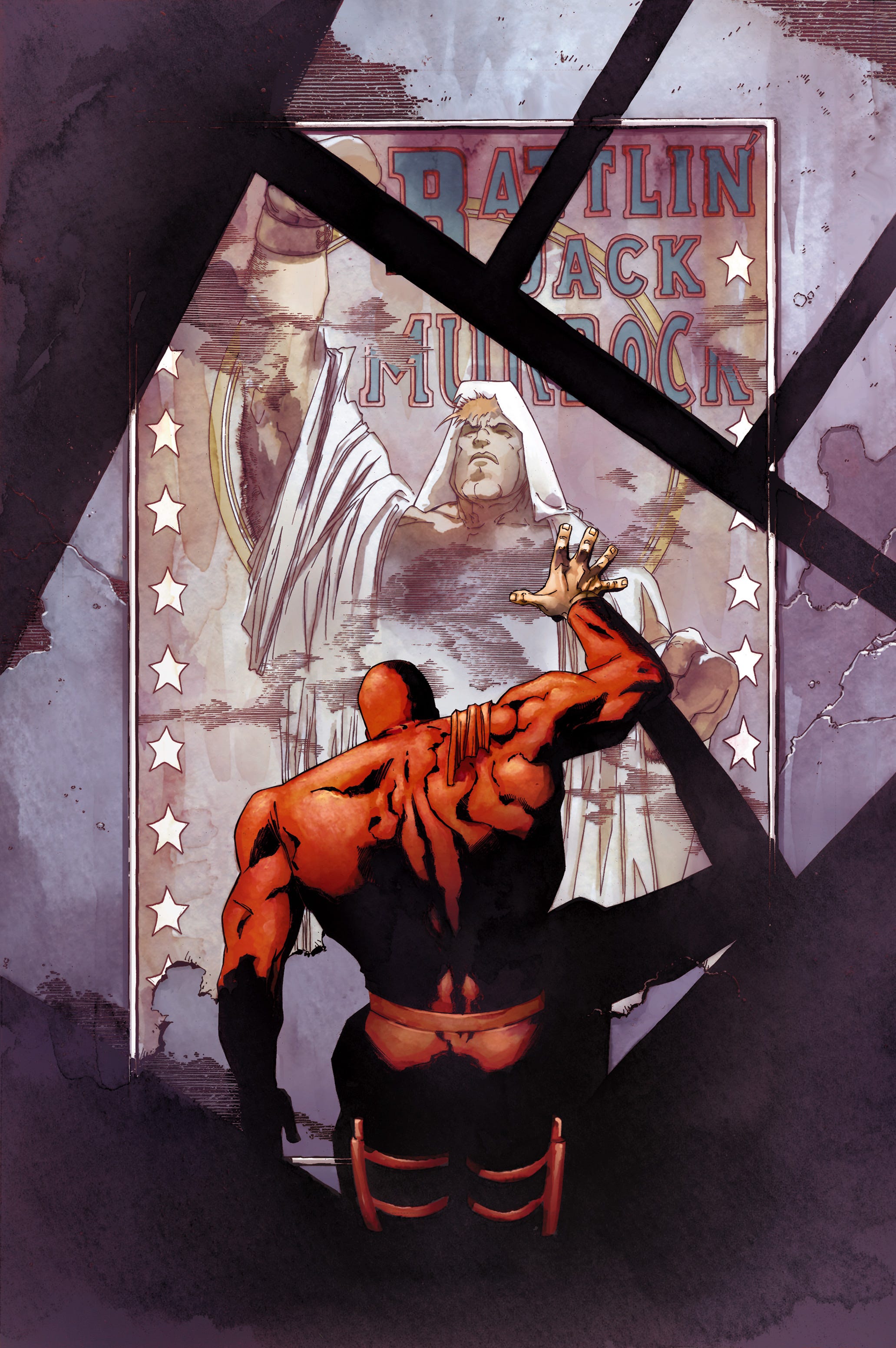
So, warm colors are pretty much the colors of fire: Orange with Yellow and Red. It’s the sun, it’s life and energy. There’s a very primal connection to these colors.
You always make fun of my overuse of purple, but, for me, it’s just using the complementary in the shadows of a yellow sun, a way to give them vibrancy instead of just deadening the colors. Because by opposition, blue and grey, desaturated and cold colors represent death, night, and inhuman sterile things.
When I was young, I saw someone die right in front of my eyes. All the little tonal variations of their skin turned into a uniform dull brownish grey. The colors literally drained from their face. Desaturation is death. It’s dread, rot, cold, desolation… Bright colors are life, power, and luxuriance.
That “warm/cold “ contrast comes from a visceral reality, it’s part of our collective psyche. It’s very effective, that’s why it’s on half the movie posters of the past 25 years, and 99% of Zack Snyder’s oeuvre.
In comics, it’s a great way to juxtapose reality and fantasy. Our dull grey daily life is interrupted by the appearance of god-like heroes wearing primary colors.
OK, so that’s the basic stuff. Now, that’s where our personal color sense comes in, developed by our individual experience.
Color Memory
JQ: I’m still stuck on “oeuvre.”
I grew up by the ocean. If you asked me to conjure an image for pure contemplative happiness, it’d be an endless sky over a sand dune. To me, the colors of unadulterated bliss are Cerulean Blue with a bit of desaturated Yellow on the side. I thought it was everyone’s answer, so I asked around. My wife sees green trees and the beige and brown buildings of her small town, my son: a Sunset over the Grand Canyon. But if someone is blissful in one of my books, they’re getting a pure blue sky.
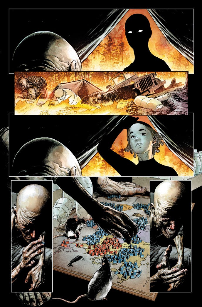
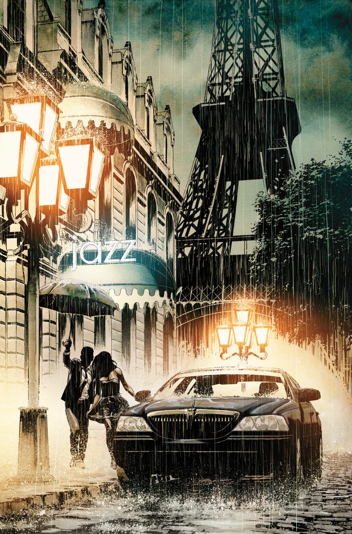
In The World To Come, I used a desaturated palette on 2 occasions: everytime we see old Ross in his lair, and for T’Challa and Monica’s engagement scene in Paris. It’s the city of lights, I could have gone with some Moulin Rouge pagentry or Van Gogh’s Colors Of The Night, but to me the Paris I remember and love has grey buildings reflecting yellowish streetlights that vaporise the rain. It’s subtle and subdued. To me that represents Romance.
JQ: TISH!
RI: You need to stop that.
All this to say that I don’t think there’s a simple formula that associates an emotion to a color. We develop our own color sense through affects, experience, and sensibility.
There are colorists who do lauded work that just doesn’t speak to me, and others who I feel don’t get the recognition they deserve. It’s just a matter of taste. I happen to have a color vocabulary that resonated with a lot of people, and, of course, with extremely talented pencillers. As storytellers, as artists, the goal is to share and communicate the universality of our own unique perspective.
Before the First Page
JQ: There’s no simple formula. But I love how your specific experience somehow becomes everyone’s emotional experience.
Everything you’ve described, like making your Paris grey with yellow streetlights instead of Moulin Rouge, is you reacting to the scene, the moment, and what’s being communicated. But I want to talk about the timeline color palette you created for The World To Come. I remember sending you the timeline document, Priest, and I created before ever starting the series, and you came back with this.
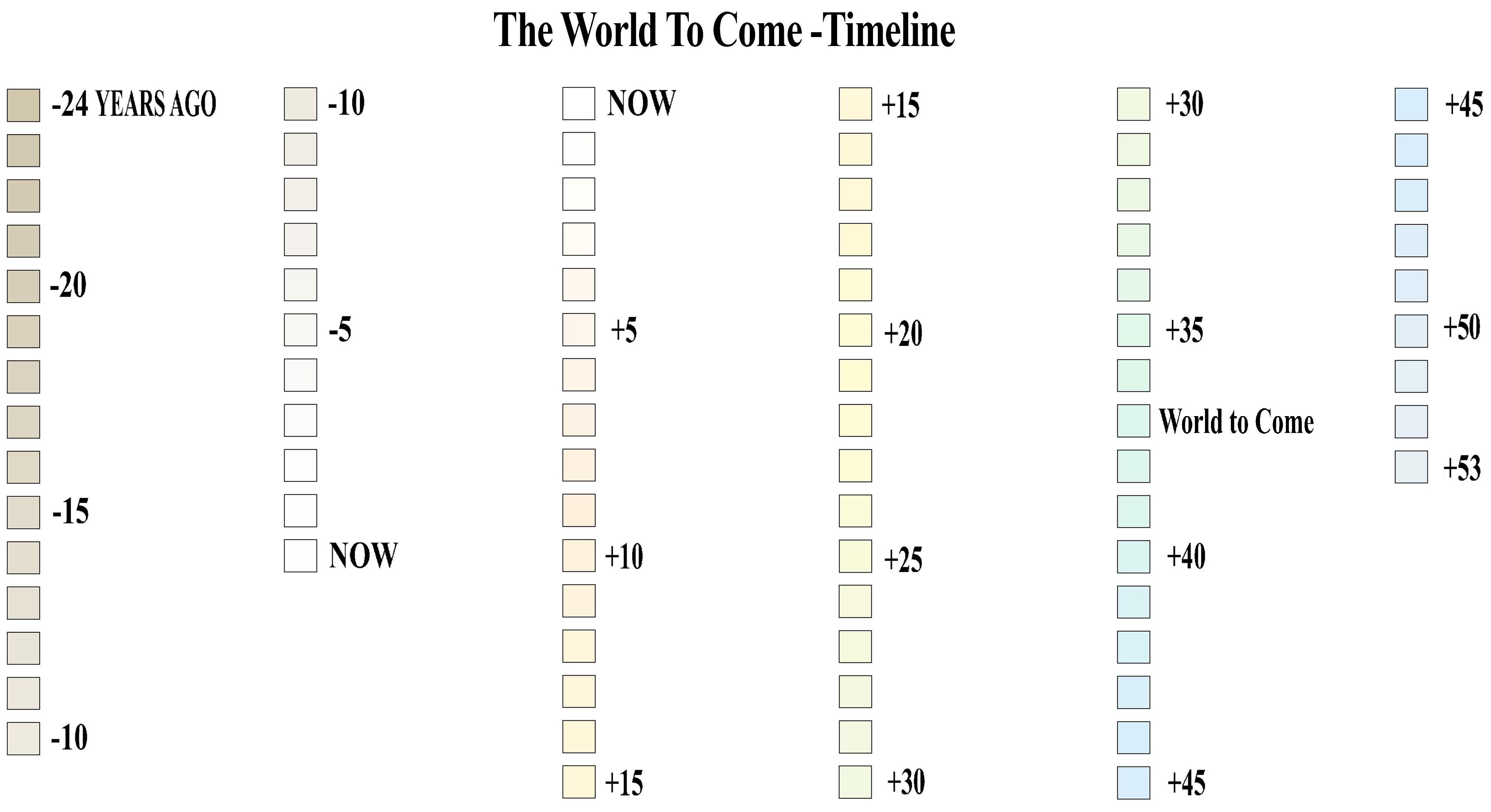
Before a single page was drawn, you mapped the emotional color arc of eighty years of story. Past equals warm earth tones. Present equals neutral. Future equals cold blue.
At what point does color stop being reactive and start being architecture? And when you’re working on something with a scope like this, how do you actually build that? Where does it start?
RI: Hey you seem to be trying to get to something, I just don’t know what. This is a fun exercise, but I don’t think of what I do as very deep. Like the Blue future, that was just because the past was Sepia like an old photo. I got a Masters in Fine Art, I'm happy to wax poetic about people shooting paint out of their ass, but I’m just not sure what we’re getting at here. God? Love? The friends we make along the way?
JQ: Okay. Fair. I wandered into interpretive dance criticism. My bad. But then again, you’re much deeper than I.
RI: This is true and obvious to everyone.
JQ: So forget God and love and the friends we made along the way, and the fact that you’re losing patience with me. Here’s the practical question, the one that actually matters to the artists and writers reading this who aren’t you:
What should they understand about that moment? The one before reading starts, when color is the only thing doing any work? Better yet, what do you wish they knew?
RI: Okay, cool. I mean, I don’t mind surfing over basic Jungian concepts, but I’d have to go over my philosophy classes’ notes and re-listen to Synchronicity to go any deeper.
I guess it comes down to what we talked about before, the emotional connection.
As you know, my wife is a film editor, we both have end-of-the-production-line jobs. She mentioned a book, In The Blink Of an Eye, by Walter Murch, who edited all of Francis Ford Coppola’s masterpieces. His theory is that emotion should be the reason for 51% of a cut. If the audience is emotionally engaged, they’ll forgive problems in story, pacing, eye direction.
The same thing could be said about colors in Comics.
The reality is: we are commercial artists. We need our books to sell, we have to stand out and be noticed. We’re postulating that colorists are at the forefront, and I’m more than happy to carry that torch, but a successful piece, for me, is one that is perfectly cohesive, when you can’t imagine that cover or that page colored any other way. You used the word reactivity, but it’s more like synergy, like we’re all working towards the perfect way to tell our story, to make the reader feel the way we want them to.
I know, it sounds pretty silly, we’re just talking about coloring superheroes, but if you’re in that comic book store, it’s very likely that at one point, one of those stories really spoke to you.
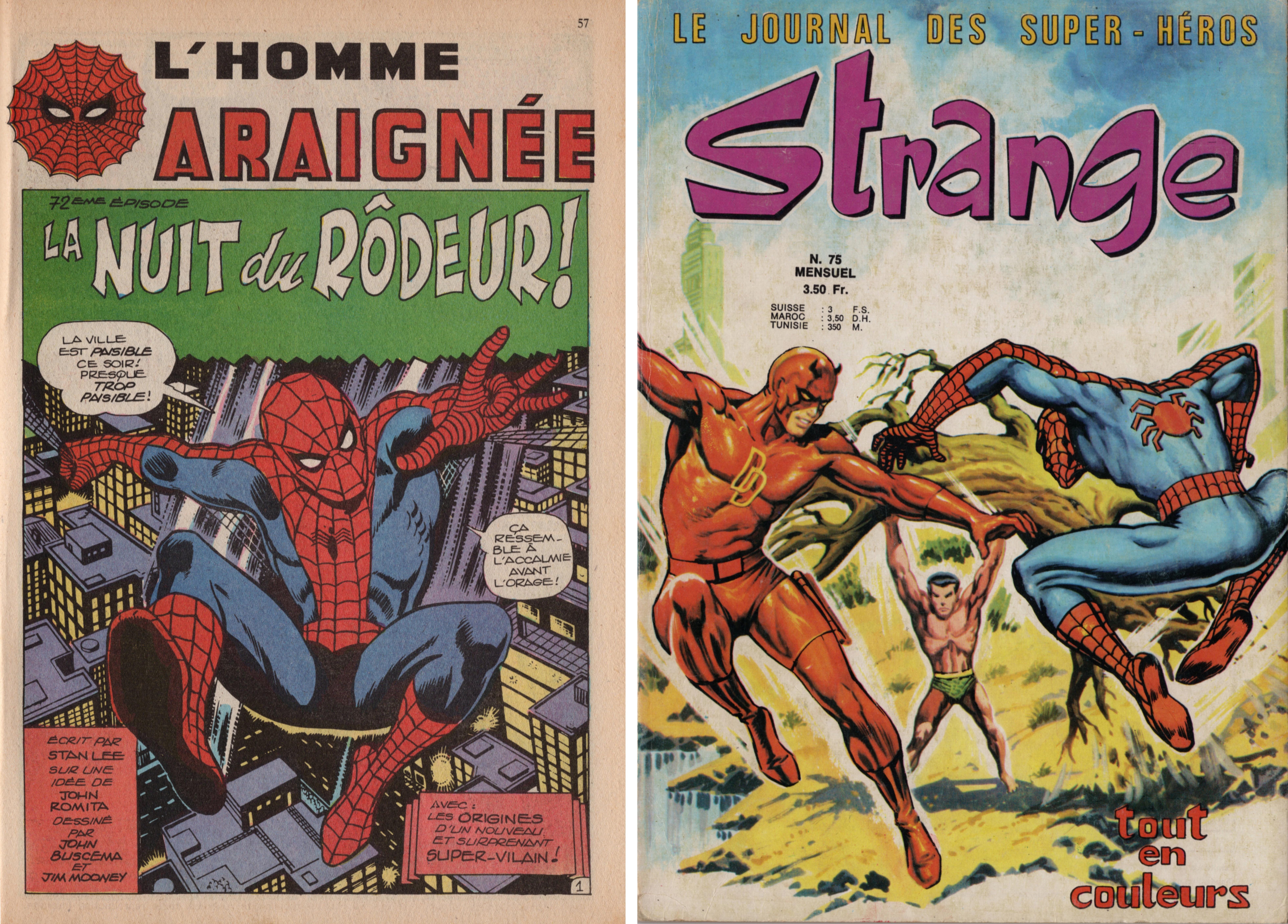
I was eight when I read my first Spider-Man. It was the Night of the Prowler, by Stan Lee and John Buscema. In retrospect, that was probably one of the most momentous events of my life. It set me on the path that led me to this very moment, talking with you.
JQ: You’ve lived a blessed life.
RI: HA! And the only reason I picked that book off the rack was that cover by French artist Jean Frisano. His job was to interpret the American covers in a style that better catered to European sensibility. Get them to pick up the book, and they’ll get hooked when they read what’s inside. Obviously, it worked.
Incredulous Awe
JQ: Eight years old. A French comics rack. A cover by a French artist, for a story you’d never heard of. And you couldn’t walk past it, and it changed the direction of your entire life.
That cover stopped you before you read a single word. Before you knew who was on the panel. Before you knew what the story was. Before any of it.
And now you are Jean Frisano for somebody.
So here’s the last question, and I’m going to keep it simple because you like to ramble on. What do you want to happen to that kid? The one standing in front of the rack right now, looking at your cover, before the book opens. The story hasn’t started yet. They don’t know anything.
What do you want them to feel?
RI: I was raised reading French bandes dessinées, my father always had some around the house, albums and magazines. But I distinctly remember that day at the store, staring at that Marvel book, how I was looking at something I had never seen before. The colors, the energy, it was all… different.
I’d love to think that I could elicit that sense of incredulous awe from someone.
The 90s were exhilarating, when we were still figuring out the possibilities of digital coloring. People were reacting so positively, they knew they were witnessing the birth of something new.
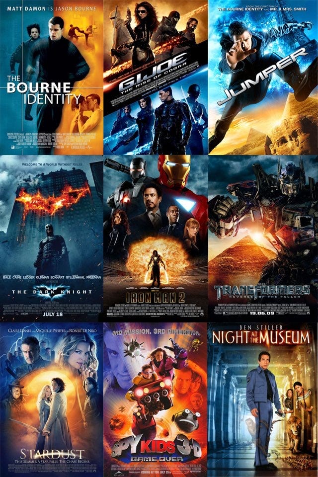
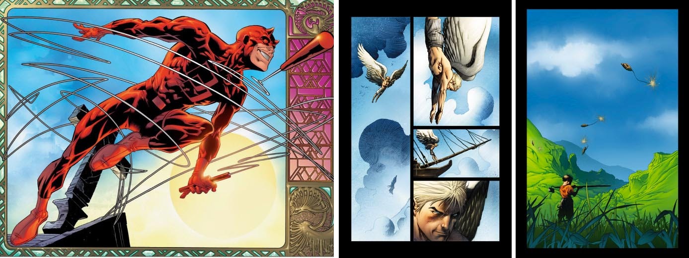
For the next step, I was very lucky to work with you, Adam, Andy Kubert, and Sam Kieth in the early 2000s. You guys always pushed me to experiment with the medium. There were times when I started with an idea, and the piece just took a life of its own. The covers we did for Origin, for example, I kinda knew what I wanted to do, but each one came out better than what I had in mind. The whole book went like that, to be honest. And the public response was overwhelmingly positive.
The Dark Tower was also really gratifying because we were able to reach the Stephen King crowd, most of whom had admittedly never read a Comic. We got to shatter their preconceived notions about the medium.
I did get the occasion to give the Frisano treatment to some classic Kirby, Kane, Buscema, and Colan, for the Marvel Masterworks, where I digitally painted a bunch of covers. As a fanboy, that was a trip.
Right now, by going back to more traditional techniques, I’m getting away from the slick digital/ AI imagery that has become so preponderant and ubiquitous. I want people to know that there’s a human behind the brush.
All this to say that after 30 years I still find ways to get excited about the work. And I hope I can communicate that to that kid who walks into a Comic book store.
JQ: By the way, did you ever get to meet Jean Frisano? Did you nerd out when you did? How did it compare to meeting me?
RI: No, I was still in high school when he died. But I definitely would have geeked out. I don’t do well when I meet my idols. I was completely tongue-tied when I saw John Buscema. I got him to sign my old Savage Tales of Conan, but I didn’t even tell him what I did for a living. And I actually declined when you offered to introduce me to Moebius at SDCC. Can’t escape that impostor syndrome.
As for you, Nanci was the editor at Marvel Knights, so I was talking to her regularly. By the time I got to you, you were completely demythified.
JQ: That’s her superpower.
Well, there you have it. The man who turned down a Moebius introduction at SDCC because of impostor syndrome just did something I’ve never managed in 25 years of working together.
He explained what he does.
If you’ve got questions about color, drop them in the comments. I’ll make sure he answers them. He owes me.
RI: Thanks. That was fun.
JQ: Was it?
RI: Maybe you should just segue into what your next week's lesson is.
JQ: Already on it.
Next Week
We’ve spent two lessons on the importance of color and where it sits in the hierarchy of storytelling: before the story has even started.
But there’s one more moment like that in comics. And this one belongs to the medium alone. Film doesn’t have it. Prose doesn’t have it. Nothing else does.
Next week: just me, and the best trick in comics.
Thanks for reading. You’re AMAZING!
JQ
This is a witty and thoroughly enjoyable back and forth that covers some excellent concepts, with relevant visual references. Well done fellas.
Incredibly interesting observation about the reader experiencing the comic in reverse order of its production!
Will have to let that sink in...
I got my start on black and white mini comics, produced on those old VERY unforgiving Kinko's machines, and maintain a fondness for greyscale design.
Presumably black and white comix would have a distinct experiential effect on readers?
Maybe less immersion, but heightened conceptual impact?
(Like in Sin City, you know you're not in the real world, but you also know for damn sure you're in THAT world?)
I read the Alan Moore, Stephen Bissette, and John Totleben Swamp Thing run recently. Starting off on the re-colored digital versions, but if felt weirdly antiseptic, so I tracked down the original issues with Tatjana Wood's beautiful living colors, and noticed something interesting...
Simple colors on textured paper creates this awesome Rorschach effect (the noise from the 4 color printing and paper grain) that allows the viewer's eye to read in their own surface interpretations.
The low-fi road arriving at a similar destination as the hi-fi :)))