
That Time I Pissed Off Will Eisner
Ego, Ignorance, and the Invisible Language of Visual Storytelling

The Very Visible Language Of The Shameless Plug
For the next few months, I’m dedicating this newsletter to imparting whatever wisdom I’ve picked up, and continue to pick up, over the course of my career. That said, this does not mean you’re safe from the occasional, unabashed, shameless promotion.
In its own way, that can still be considered imparting wisdom, right? Yes, self-centered. But wisdom nevertheless.
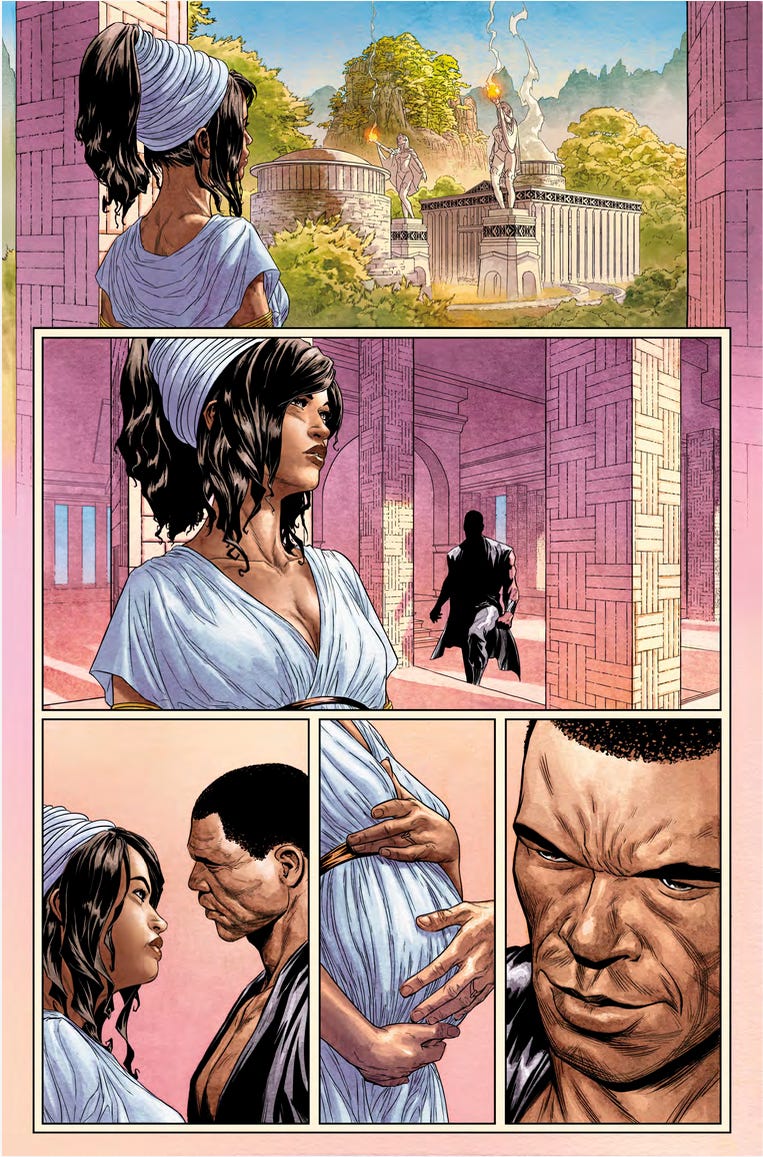
The Batman: Sword of Azrael Deluxe Edition will be hitting store shelves on April 4th. Not only does it feature a brand-new cover by the original creative team, myself on pencils, Kevin Nowlan on inks, and colors by Lovern Kindzierski, but this redesigned edition is packed with extras. That includes the now-legendary, rarely seen crossover issue between Ash and Azrael.
Hot damn!
You may want to preorder this one from your local retailer. Supplies will be limited.
Now, even a shameless plug can have some meat on it, so let me talk briefly about the cover before we get to the actual meat of today’s newsletter.
When DC editor Reza Lokman called and asked if I’d be interested in doing a new cover, I jumped at the chance. Azrael is where I really began learning my craft, under the tutelage of Denny O’Neil and the greatest editor in the history of comics, Archie Goodwin.
Don’t get me wrong, I made my mistakes on that series. There’s a ridiculous and completely senseless vertical double-page spread in there that still makes me wince. But I was also incredibly lucky to be learning at the feet of two masters.
Reza sent me the template for the wraparound hardcover, including where the flaps would fall, and said, “Don’t worry about drawing into the flaps. They’ll just be covered with text.”
You know what I heard?
“I dare you to draw into the flap area and see if you can make it work with all the text. I bet you can’t. BWAHAHAHA!”
Challenge accepted, Reza!
I have a long and proud history of making things more complicated for myself, even when absolutely no one asked me to.
Here’s the final cover.
If I were designing this as a single poster for the viewer to take in the entire image at once, it would look very different. But this wasn’t a poster. This was a book cover that had to function in pieces, with information scattered across it.
So I designed for that reality.
I accounted for everything except one block of text that ended up landing in the lower middle of the back cover. That was a late addition, but the design team handled it beautifully, so it still works for me. I suspect that text would normally have lived on the right flap, but they opted for the larger callout instead.
And this, to me, is the most important part of the design.
What someone actually sees on the stands.
Whether it works or not, that’s up to you to decide.
I bring all of that up because I didn’t always understand what I was designing for. Not the cover flaps. Not the reader. Not even the medium itself.
And nowhere was that blind spot more obvious than when I was in school.
The Invisible Language of Visual Storytelling
Part Two: Before You Think, You Feel
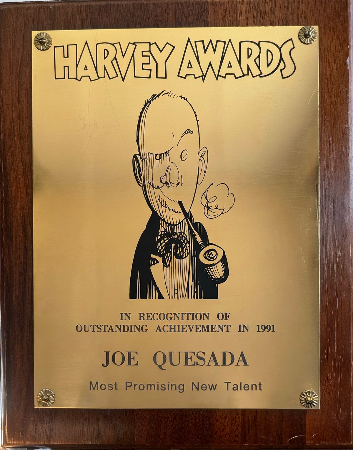
For those of you who don’t know, I graduated from the School of Visual Arts.
I was an illustration major and had zero interest in comics.
Less than zero, actually.
I was a full-blown comic snob.
My last real interaction with comic books was when I was twelve, so in my head, they lived firmly in the category of things meant to entertain kids. I wanted to be a “serious” illustrator. Norman Rockwell. N.C. Wyeth. Alphonse Mucha. That was the lane I was aiming for.
On top of that, I was burned out on art altogether and had fallen hard for music. That’s where my energy was going. Writing songs. Playing. Chasing a completely different creative high.
Every semester, though, SVA offered a few comic book courses. And every semester, despite myself, I felt a tug. Part nostalgia. Part curiosity. I ignored it for years.
Then, in my senior year, I finally gave in and signed up for the two comic courses available at the time. One was a humor class taught by the legendary Harvey Kurtzman. The other was a course on sequential storytelling taught by Will Eisner.
Yes. That Will Eisner.
To give you a sense of how little I cared about a future in comics at that moment, I failed both classes.
Not because I didn’t show up. Not because I didn’t participate. All you had to do to pass was complete a final project. But by then, I was so deep into music and so convinced comics or illustration weren’t where I was headed that I never bothered to finish the assignments.
Yup, pretty dumb.
Fast forward to 1990.
I’m at San Diego Comic-Con, at some industry function. Hell, it might have even been the Eisner Awards. I see Will Eisner across the room and decide to introduce myself. I tell him who I am, what I’m working on. Look at me, Mr. Eisner. I’m a professional!
Then I mentioned that I’d been one of his students at SVA.
Will lit up. He’s genuinely pleased. Happy to see one of his students out in the world, making comics.
And then I made what, in retrospect, was a real dick move.
I told him that he failed me.
Knowing how easy it was to pass his class, his demeanor changed instantly.
He sighed. Rolled his eyes. And walked away.
That was it. That was my one and only interaction with Will Eisner outside the classroom.
I’m not proud of that story. But that’s kind of what this newsletter is about. No varnish. No mythology. Just the truth.
I think about that moment a lot now. Not because I embarrassed myself. I mean, I did. But because I missed the opportunity to really learn from one of the greatest storytellers of his generation.
In a strange way, I’ve spent the rest of my career trying to make up for that mistake.
Not just by learning the craft on my own, but by slowly realizing what I couldn’t see back then. That comic books are one of the purest storytelling mediums there is. Not juvenile. Not lesser. Just misunderstood.
Which brings me to where we’re headed next.
Because before panels, before pacing, before any of the mechanics we’re about to talk about, there’s something more fundamental that Will understood better than almost anyone.
Storytelling doesn’t begin with rules.
It begins with how the human brain reads images.
That’s where we start.
Before You Think, You Feel
Before we get anywhere near panels, page turns, or camera angles, we need to talk about something even more fundamental.
Your brain.
Not the part that reads words.
The part that reacts first.
Because long before you decide whether something makes sense, your brain has already decided whether it feels right.
And that decision happens fast.
Your Brain Is a Pattern-Recognition Machine
You don’t look at images passively.
You scan them.
Your eyes move, your brain prioritizes, and your nervous system makes snap judgments about importance, danger, balance, and intent. All of that happens before you consciously “read” anything.
This isn’t learned behavior. It’s survival wiring.
As human beings, we evolved to read:
faces
body language
direction of movement
proximity
imbalance
threat
Instantly.
If something is moving toward you, your brain notices.
If something feels off-balance, your brain notices.
If two people are facing each other versus standing apart, your brain notices.
You don’t think about it.
You simply feel it.
Why This Matters for Storytelling
This is where storytelling either quietly works or quietly breaks.
Every image you put in front of a reader is already being interpreted before they slow down enough to read dialogue or captions.
They already know:
where to look
who matters
whether a moment feels calm or tense
whether they feel oriented or adrift
If those signals line up with the story you’re trying to tell, the reader relaxes.
They trust you.
If they don’t, the reader starts compensating. They reread panels. They backtrack. They hesitate.
That’s not engagement.
That’s friction.
Reading Images Is Older Than Reading Words
Here’s the part most people overlook.
You learned how to read pictures before you learned how to read language.
As a child, you didn’t need words to know:
who was angry
who was in charge
who felt safe
when something was wrong
You read faces. Posture. Distance. Direction.
That instinct never leaves you.
Which means visual storytelling isn’t about teaching the reader something new.
It’s about aligning with something they already know at a gut level.
Author Derek Thompson talks about this in his book Hit Makers: The Science of Popularity in an Age of Distraction. His argument is simple and dead right. Ideas that are too far ahead of their time tend to fail not because they’re bad, but because they ask the audience to absorb too much unfamiliarity all at once.
The ideas that break through do something smarter. They introduce something new, but they wrap it in something we already recognize.
Surprise paired with comfort.
Innovation anchored by familiarity.
When storytelling works, it feels effortless because it’s cooperating with instincts that were formed long before art, comics, or cinema existed.
Why Confusion Feels Physical
This is why confusion doesn’t feel intellectual.
It feels emotional.
When visual signals start contradicting each other, the brain doesn’t say, Interesting experiment.
It says, Something’s wrong.
And when that happens often enough, the reader doesn’t lean in.
They pull back.
Not because they’re impatient. Not because they’re unwilling. But because the experience has stopped feeling intuitive.
Great storytelling feels like being carried.
Poor storytelling feels like being asked to navigate without a map.
This is one of the things I always loved about Garth Ennis and Steve Dillon working together. Reading those books felt seamless. You never sensed where the writer ended and the artist began. There was no friction. Just immersion.
It’s also why I struggle with movies where the hand of the director is constantly visible. I don’t want to spend my time thinking about how the film was made. I want to be inside it.
That’s the goal.
Disappear.
Let the story do the talking.
This Is Where Rules Come From

This is important, so I’ll say it plainly.
The rules we talk about in storytelling weren’t invented arbitrarily.
They emerged because creators, over time, discovered what the human brain consistently responds to.
Direction matters because the brain interprets movement as intent.
Balance matters because imbalance signals instability.
Continuity matters because the brain looks for spatial logic.
These aren’t artistic preferences.
They’re grounded in how people naturally and unconsciously perceive the world.
Once you understand that, the rules stop feeling restrictive.
They start feeling useful.
Why This Chapter Exists
I want to pause here and make something clear.
Some of you are eager to get to the mechanics. The diagrams. The tricks. The tools you can apply immediately.
We’re going there.
But if you skip this layer, the rest becomes memorization instead of understanding.
If you know what works but not why it works, you’ll always be guessing when it’s safe to bend or break the rules.
If you understand the underlying instinct, you’ll know exactly when breaking a rule will add tension instead of confusion.
That’s the difference between intention and accident.
What Comes Next
Now that we’ve established how the brain reads images instinctively, we can start talking about how storytellers guide that instinct.
Next time, we’ll look at direction.
Not movement yet.
Not action.
Direction.
Why left, right, up, and down carry emotional weight.
Why neutral is a powerful choice.
And how orientation quietly sets expectations before a single word is spoken.
This is where the language starts becoming practical.
And once you see it, you won’t be able to unsee it.
Thanks for reading.
You’re AMAZING!
JQ
P.S. If you ever wonder whether the universe has an ironic sense of humor…
I was in Eisener's class then too. I was one of the serious ones, who sat in the bck of the class working on his projects while most students went up front to hear his stories and grab the comics he would hand out. He was a very funny, charming man who obviously loved the craft. I also recall the class magazine, whose cover was printed in red ink. I really loved my time there and remember it fondly. After a few years in advertising, I went on to Marvel to pencil Morbius, Spirits of Vengeance, then Blaze. I wish I'd stayed in touch, he was a good guy to know.
For what it's worth, I think the back cover text should've been on the inside front cover flap. The only reason to switch things around would be because the quotes inside the flap are too tall to fit in the available space on the back cover, and would have to be stacked 2x2. That would confuse the reading order, but if they were printed diagonally instead, they'd fit, even if the last quote had to be across the entire bottom. So it's not a design choice that I agree with.
Also FWIW, I will never understand why the people at DC, especially in the ten years or so following the tremendous success of The Smurfs, did not comprehend that the name "Azrael" would always be associated with Gargamel's cat. Let's face it -- the Smurfs were far more popular than any comic book being published at the time. You couldn't not be aware of it! And DC did it twice -- first Marv Wolfman did it in The New Teen Titans while The Smurfs was still on the air, and a lot of his readers were fans of both. Then Denny O'Neil did it again about five years later. It would be like calling a serious character "Homer" today. It just showed how completely out of touch they were with their readers, or at least their readers' frame of reference. How many comic book characters are called "Garfield" now? Or anyone, for that matter? Some names just aren't up for grabs anymore once they reach a certain level of notoriety, and anyone reading comics back then would've immediately associated "Azrael" with The Smurfs, which completely undercut the character. And yet, DC did it twice!
Sorry, but that's always bugged me. It doesn't matter what the name originally meant, it only matters what people currently associate it with.