
Size Matters
A Hard Lesson I Learned After Three Decades in the Comic Book Industry

Next Stop On The Joe Q 2026 World Tour
What could possibly be better than going to Disney World in Orlando?
Meeting me.
Hyperbolic? Possibly.
But let me live in that world until at least the end of this newsletter.
That said, if you’re heading to the show, you can purchase tickets for the full Joe Quesada Experience, and I’ll be signing, doodling, and doing… whatever it is I do.
Table P43
Thursday: 4:00–7:00 PM
Friday: 11:00 AM–1:00 PM and 3:30–6:30 PM
Saturday: 11:00 AM–1:00 PM and 3:30–6:30 PM
Sunday: 11:00 AM–2:00 PM
AMA Panel: 2:30 PM in Room W102b
Let’s Take A Deep Breath
We’ve reached the point where it’s worth pausing for a second and talking about what we’ve covered so far and why these lessons are structured the way they are.
The reason is simple.
It’s a lot.
I could absolutely compress all of this into shorter tutorials. But I’m intentionally spending more time on each idea than you might see elsewhere, and Substack gives me the freedom to do that.
It’s one of the many reasons I like the platform so much.
That said, I’m also aware that some of you might be following along and starting to question your own work.
Maybe you’re wondering if you’re applying everything correctly.
Maybe you’re overthinking it.
Or worse, maybe you’re not even sure where to start.
Well, I have good news and bad news.
First, the bad news.
There’s more coming.
We’ll continue digging into visual storytelling, but I also have tutorials planned for things like cover design, coloring, and building the perfect portfolio.
Yes.
I said perfect.
The good news?
I have a story for that.
Dazed and Confused
Sometime in 1993, legendary artist and prince among men Howard Chaykin made a recommendation that would change my life.
Actually, “recommendation” might be the polite version.
I distinctly remember some finger wagging and words to the effect of:
“You’d better take the Bob McKee screenwriting seminar, kid.”
Now that may or may not be exactly how it happened. But this is my newsletter, and a finger-wagging Howard Chaykin is a much more entertaining image than some calm sage gently pointing me toward enlightenment.
What Howard was really telling me was this:
Whether I wanted to be a writer or not, the more I understood story and structure, the better a visual storyteller I would become.
What he may not have known at the time is that I did want to be a writer.
I had a head full of ideas.
What I didn’t have was the confidence or the craft to bring them to life in a way I’d actually be happy with.
So I signed up for the next McKee seminar coming to New York.
It was three intense days breaking down what makes stories work. The seminar focused on film, but every concept translated immediately to comics.
Every morning, I was there early, taking notes like a court stenographer on his tenth espresso.
Then on Sunday, he completely blew my mind.
We were handed the screenplay for Casablanca and spent the next six or seven hours dissecting the movie.
Scene by scene.
Line by line.
It gave me a whole new appreciation for the level of craft that goes into great storytelling.
But here’s the part nobody tells you.
The following week, when I tried to apply everything I had learned…
I was completely lost.
More confused than before I took the course.
Because it was a lot.
But then something interesting happened.
Over the next few weeks, I’d read a comic script, watch a movie, or write something of my own, and little by little, what I had learned started working its way into my thinking.
Naturally.
Without forcing it.
It slowly changed how I looked at stories, how I analyzed them, and how I approached my own writing and artwork.
So this is my long-winded way of saying:
Chill.
If you’ve been reading these lessons and taking it all in, you’re going to be fine.
I’ve been exactly where you are.
The Invisible Language of Visual Storytelling
Part 9: Size Matters
Once every page has three oversized panels, a splash, a giant close-up, a shock beat, a reaction beat, and another reaction beat, because why not, you’re no longer controlling emphasis.
You’re flattening it.
Everything is big.
Which means nothing is.
Drawing big, dramatic panels is fun.
Restraint a little less so in the beginning.
But once you start doing it with intent, not only is it fun…
it’s more powerful.
The reader doesn’t need you to scream all the time.
They need you to know when to raise your voice.
A lot of artists assume bigger automatically means louder.
It doesn’t.
I think part of this comes from the 90s, when artists realized splash pages, especially ones with heroes posing heroically, sold for higher prices than pages with multiple panels.
The result was page after page of splash images packed with word balloons as writers struggled to squeeze story content onto pages where the characters weren’t doing much more than standing around looking impressive.
Sure, it looked cool.
But that’s not storytelling.
Bigger only matters when something smaller came before it.
That’s what gives it force.
That’s what makes it land.
Panel size is not just space on a page.
Size Is Emphasis
A large panel tells the reader:
Stay here.
This matters.
A small panel says:
Keep moving.
We’re building toward something.
Neither is better.
They simply do different jobs.
A series of smaller panels creates motion, rhythm, anticipation.
It builds energy.
Then the larger panel arrives and cashes it in.
That’s crescendo.
The Hidden Question
Every time you choose panel size, you are answering one question.
How loud is this moment?
That’s it.
Not how cool is it.
Not how much detail can I fit in it.
Not how much drawing do I want to show off.
How much emphasis does this moment deserve?
Ask that honestly, and your layouts get better fast.
Because you stop thinking like an artist protecting images and start thinking like a storyteller, controlling emphasis.
That’s the shift.
The Large Panel Is Only Powerful Because Time Led Us There
This is where Lessons 8 and 9 connect.
A large panel means very little without rhythm before it.
You need buildup.
You need beats.
You need a controlled pace that gives the larger image permission to arrive with force.
Otherwise, it’s just self-importance.
The reason a splash works is not because it’s a splash.
It’s because the story created enough tension that the release needed more room.
That’s why size matters.
Not as spectacle.
As payoff.
Crescendo Only Works If You Plan It
Music doesn’t usually start at full blast.
It can, but when it does, it’s making a very specific choice.
Because if you begin at maximum volume, you’ve limited how much louder the story can get.
The same is true in comics.
If page one, panel one is already the biggest, loudest image you can draw, you’ve spent one of your strongest tools before the story even begins negotiating with the reader.
Now, before someone emails me a stack of Silver Age comics and yells,
“But every issue used to start with a punch!”
Yes.
They did.
But that was the newsstand era.
Back then, comics weren’t written in neat six-issue arcs designed for collected editions and bookstores. Every issue had to sell itself to someone who might never have read the book before.
Which meant two things were almost mandatory.
Start with a bang and a recap.
End with a cliffhanger.
That doesn’t mean you can’t open big.
You absolutely can.
Many comics still open with a splash page for exactly that reason.
If a reader casually picks up a title, wondering whether to buy it, the first things they see are the cover and the first page.
That page has a job to do.
Pull the reader into the story immediately.
But even when you open big, the same principle still applies.
Beethoven’s Fifth Symphony kicks the door down the moment it starts.
You know it.
Da-da-da-DAAA!
But Beethoven doesn’t stay there.
He moves the volume up and down. He builds tension, releases it, and builds it again.
Storytelling works the same way.
Escalation isn’t just about getting bigger.
It’s about controlling emphasis.
Big Panels Are Not Rewards for Action
This is where people often get it wrong.
They save the big panel for the explosion.
Fair enough.
But an explosion is not automatically more important than:
A kiss.
A look.
A lie.
An establishing shot.
Or the moment someone realizes they’ve just lost everything.
Big does not mean action.
Big means emphasis.
Sometimes the loudest moment on the page is silent.
Sometimes the panel that deserves the most real estate is not the punch, but the breath before it.
Or the aftermath.
That’s judgment.
And judgment is storytelling.
Check out this opening splash from Fantastic Four #67. It isn’t explosive. It’s essentially an establishing shot doing heavy lifting, including recapping where issue #66 left off in case you missed it.
Kirby decides to use one more splash page in the issue, and it’s for this moment.
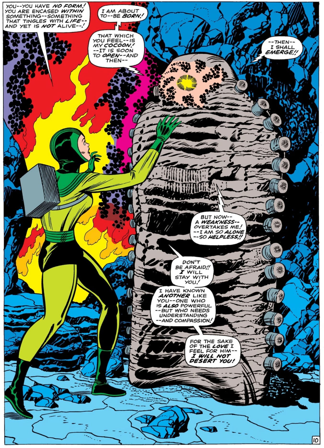
It’s not an explosion.
It’s a revelation.
And Kirby is demanding that you stop and take it in.
This moment matters more than the punches that follow.
That’s emphasis.
Volume Changes Meaning
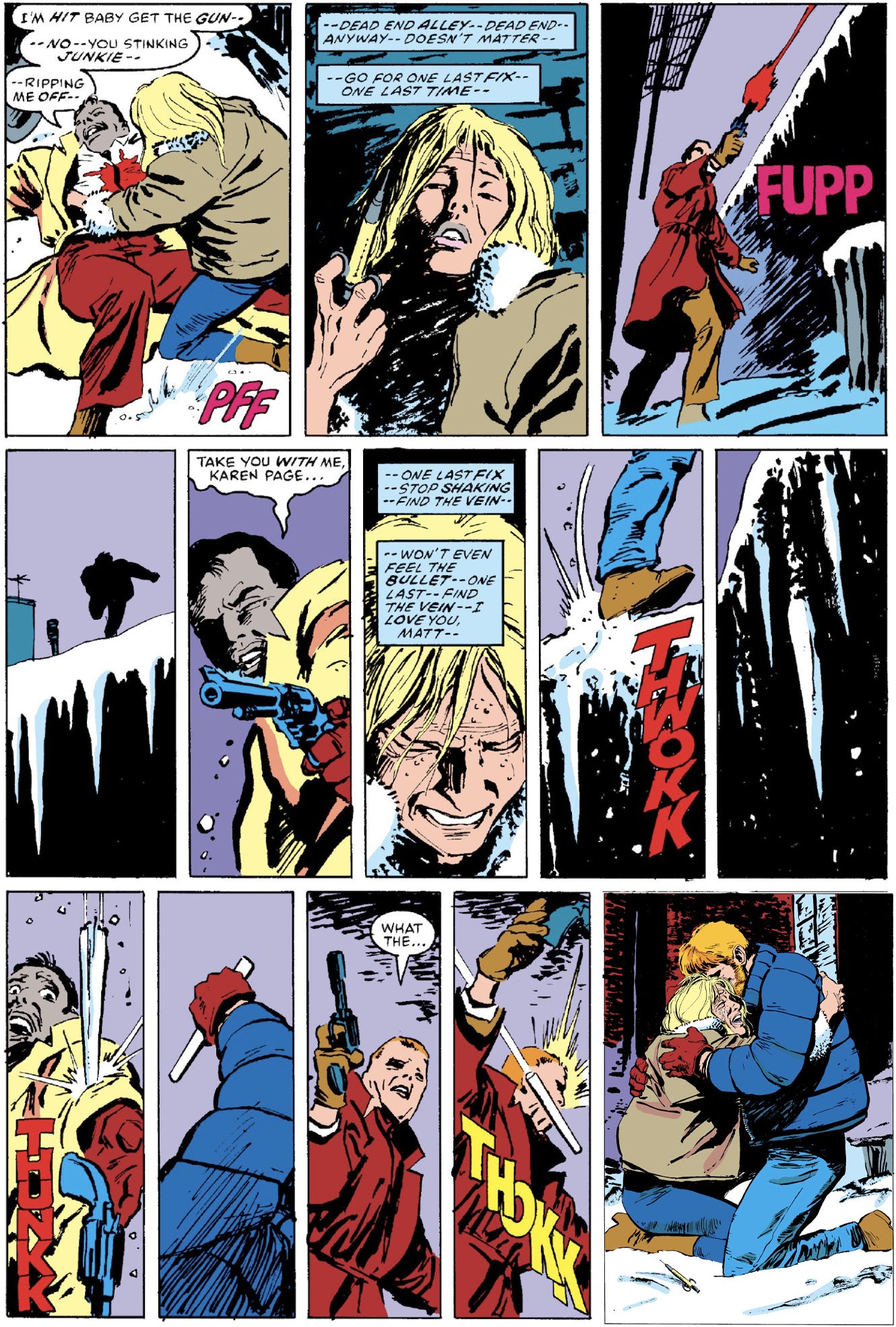
Let’s look at this moment from Daredevil #227, during the Born Again saga.
Karen Page has fallen as deeply down a black hole as any Marvel character had at that point. She’s deep into drugs and has betrayed Matt Murdock, the man she loves, until a shadowy figure steps back into her life.
David Mazzucchelli uses fourteen panels to deliver this moment.
The pacing is rhythmic. Fast. Almost breathless.
And he does it because he’s building toward a release.
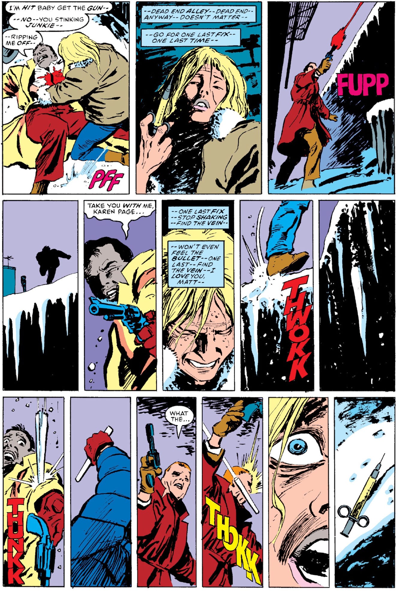
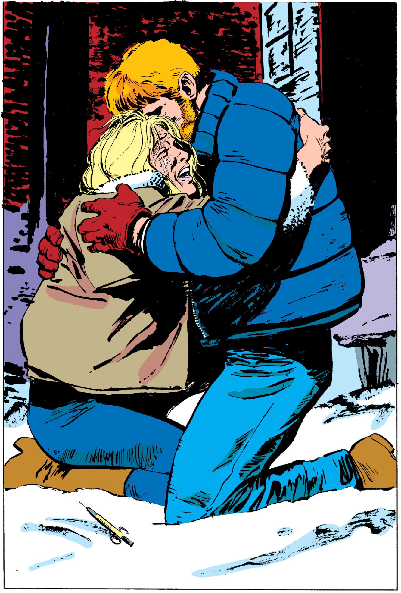
Then the page lands.
Matt saves Karen.
And forgives her.
All in one moment.
One of the loudest quiet moments in comic book history.
Now that you’re equipped with the tools from earlier lessons, take another look.
Do you see the left-to-right movement?
The vertical staging?
The way the hypodermic needle sits in the snow?
Two pages.
An enormous amount of story.
But imagine if the page were composed differently.
Same event.
Different emotional volume.
That’s what panel size controls.
Not spectacle.
Meaning.
Because volume is created through juxtaposition.
Quiet panels next to loud ones.
Compression next to release.
Motion next to stillness.
Without that contrast, the moment doesn’t land.
The Page Is an Instrument
Once you start thinking musically, panel size becomes obvious.
Small panels are short notes.
Wide panels are sustained notes.
Large panels are crescendos.
The page is not static.
You are not arranging boxes.
The page performs.
You are composing sound no one can hear, but everyone feels.
That’s the beauty of comics.
The Sound of a Page Turning
There’s another trick quietly working with scale.
The page turn.
A reveal at the top of a page lands one way.
A reveal waiting on the other side of a page turn lands very differently.
That moment of surprise is not an accident.
Panel size controls how loud the moment is.
The page turn controls when the sound hits.
Use them together, and the reader feels the impact.
Interestingly, the way we use page turns today isn’t how they were always taught.
I remember learning this in a conversation with the late John Romita. Older comic artists were often trained to begin the next scene in the last panel of the previous page, not after the page turn.
That thinking, once again, came from the newsstand era.
The goal was simple.
Keep the reader moving.
The bottom panel often served as a visual bridge to the next moment. The reader would see the new location, understand where the story was heading, and naturally turn the page.
Modern storytelling often flips that logic.
Now we hide the reveal after the page turn so the reader discovers it the instant the page flips.
It’s closer to a film cut.
Neither approach is wrong.
It’s simply a case of the format evolving with how comics are sold and read.
But both rely on the same underlying principle.
Timing.
Oh, The Horror
I’ve said on more than one occasion that the toughest genre in comics is horror.
And the reason comes down to one simple difference between comics and film.
In movies, the director controls the clock.
They decide when the music stops.
They decide how long the silence lasts.
They decide the exact frame the monster appears.
The audience has no say.
That’s why jump scares work so well in horror films.
Comics don’t work that way.
In comics, the reader controls the timing.
They decide how fast to read.
They decide when to scan the page.
They decide when to turn it.
Which means comics are terrible at the kind of jump-out-of-your-seat scare movies love.
The reader pulls the trigger themselves.
But what comics lose in sudden shock, they gain in something far more powerful.
Dread.
Because once an image is on the page, the reader can’t escape it.
In film, the shot cuts away.
In comics, the moment lingers.
The reader can stare at the terrible thing for as long as they want.
Which means the most effective horror in comics usually isn’t the scare.
It’s the realization.
The wrong shape in the background.
The shadow that shouldn’t be there.
The moment a character understands something terrible.
Or worse.
The moment the reader understands it before the character does.
That’s where comics get under your skin.
The page turn isn’t a jump scare.
It’s a cymbal crash.
And if you’ve controlled the rhythm leading up to it, the reader will feel it land.
The Crescendo Is a Promise
A larger panel is a promise to the reader that the moment matters.
Don’t make that promise lightly.
And don’t make it constantly.
Save it.
Earn it.
Land it.
Size does not create importance.
It reveals it.
That’s how volume works in music.
And that’s how it works in comics.
Next time we’ll talk about what happens when you remove sound entirely.
Thanks for reading.
You’re AMAZING.
JQ
Another great tutorial. One thing I learned at Madefire, when I was pioneering an alternative digital storytelling platform, was that so much is about timing. And you’re so right about horror, but it’s also true of comedy. The gag, like the shock reveal, can often work most effectively on the page turn.
Starting out at Marvel, back in my Death’s Head II and Hulk days, the splash was all the rage. Every page was splashy. But speaking of horror, by the time I came to The Man-Thing series the storytelling was reverting back to something more classic. We had a number of 16 panel pages in that series. I think that’s the strip where I really cut my teeth as a storyteller, thanks in no small part to the astonishing script by Marc DeMatteis.
Great stuff. Jim Starlin wrote a Batman mini series ",The Cult". The end of issue 2 where Robin rescues a mentally broken Batman in the sewers was mind jolting. Robin describes the visceral scene and stench en route to his partner. The end is a splash panel of Batman facing Robin dazed and confused in this abatoir.
The reader has lost all faith that the hero can make a comeback from this.